Know Thyself - And Then Create a Fab Color Palette

Friday, May 1, 2009

Over the years of decorating missteps and oh-that's-REALLY-wrong's I've figured out what I'm most comfortable living with in my home vs. what's going to drive me crazy. I love so many things out there that it's sometimes hard to be focused, but I've learned that if I create a list of colors and other elements that I know I love and then choose from that list when decorating my house, it's pretty darn likely that I'll be happy with it for a while...yes, even I (Ms. Compulsive Decorator) will be happy with it.


Here's my foolproof list:

White/Cream


Straw/Seagrass/Natural Fibers/Pine Wood


Taupe


Dark Chocolate-Espresso Brown


Black Accents


Silver/Mercury Glass/Chrome


Blue and Green


As you can tell, these are all natural beach-like elements with some classic European flair thrown in. Apparently, that's my thing. I have a good friend who's most comfortable in warm, rich colors and wood tones - that's her thing.

Most of us know what we like and dislike, but try narrowing it down to a handful of elements and see what you come up with. I know for myself, by identifying a set list of things I know I love, the chances greatly increase that I'll end up with a room I'll love. I know...duh...but seriously, give it a try.
Photo Credits (all bazillion of them): White/Cream: 1. Pottery Barn Belgian Sofa, 2. Coastal Living; Straw: 1. Pottery Barn, 2. West Elm, 3. Country Living, 4. Bhg.com; Taupe: 1. Jbeachem on Rate My Space, 2. Cottage Living; Espresso Brown: 1. White Twig on Etsy, 2. Pottery Barn; Black Accents: 1. Ikea Molnig Chandelier, 2. My own "F"; Silver: 1. Delta Kingston Faucet, 2. West Elm; Blue/Green: 1. Alicia Bock on Etsy, 2. Pottery Barn, 3. Pottery Barn.

Garage Sale Pile to Treasure

Wednesday, April 29, 2009

Here's the other little project I did over the weekend that I promised I'd share with you.

I pulled this old chair out of my "sell-whenever-you-get-around-to-having-a-garage-sale" pile and decided to improve upon it a bit. And yes, I really was going to sell this unique little chair, but in my defense it had bad memories so I didn't want it around. Instead I decided to turn lemons into lemonade and make it something wonderful that I can love.

I distressed it a little with some sandpaper and then painted the year "1924" on the back rest (which happens to be the year my sweet Grandma was born...I like things around the house to have meaning to them).

I was crazy enough to draw the numbers freehand (with pencil) first, and then use a tiny brush and black craft paint to paint by hand. It seemed to work out ok.

And then....wait for it....wait for it....shazam! I decided to go the extra mile by painting a garland on the back...even though the chair is up against the wall most of the time and nobody will ever see it. At least I know it's there.


Overall, I'm loving the "new" chair. It adds a little more character to the living room...and cost next to nothing!

Weekend Spruce Up - Tablescape

Monday, April 27, 2009

First, Edie at Life In Grace is having a painted wood linky party today. You have to go over there and see what a unique transformation she achieved with her kitchen. I wish I was that fun :).
________________________________________________________


So, I didn't quite get around to mopping the floors or raking leaves out of the flowerbeds this weekend. I did manage to do a couple other projects, though...really, isn't decorating more fun than cleaning?...can I hear an "amen"?!


Here's the first project I tackled (I'll mention the other one later in the week). I was pretty unhappy with the decor on the chest of drawers in my living room. It wasn't terrible, but it was just kind of ohhhkay.

I wanted something more monochromatic, more polished, more wow...you get me? So I went back and studied this post from the Nester on tablescapes. I then reworked my own tablescape using only items I already owned.


I leaned two black and white frames against the wall, and put tan linen fabric in one because I didn't have a good black and white print to go in the frame. I think it worked out alright.


I switched out the lampshade with a white one from the guest room.


I stacked some books and a mother of pearl box (that I bought forever ago at TJ Maxx) on top of a platter.


I also placed a little bird and her nest under a cloche on a small vintage cake stand. Don't feel bad for the bird though. She's very happy under there....she told me so.

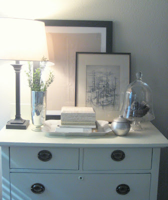
Have a great Monday!

Thrifty Decor Ideas - Shabby Nest Party!

Thursday, April 23, 2009

Wendy over at the Shabby Nest is having a Linky Party today featuring creative and thrifty decorating ideas. Thrify ideas and a party?! Oh, you know I couldn't miss that.


So here's my contribution. Large sheets of watercolor paper. Huh...You say? Stay with me people.


You know those fancy schmancy framing mats that cost at least an arm...if not a leg too? They look great, but thrifty they are not. Thick, textured watercolor paper on the other hand is very affordable at $2-$4 for a huge poster size sheet (at Hobby Lobby...even less if you have a 40% off coupon), and it can give the same look as fancy mats.


For example, here I just taped inexpensive postcards on top of the paper, and voila...we have custom art...more or less.


And on this one I cut a square and then taped some perdy fabric behind.

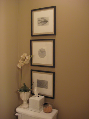
And these are my most recent creations. I printed some pictures I found here (on a regular black and white printer...because that's all I have), cut them to size and taped them onto watercolor paper. Then I went the extra mile by taping the whole shabang onto burlap. How much did this whole project cost?...around $6 for all three (excluding frames...which I did buy when they were 50% off at Hobby Lobby).


Just remember my friends, where there's a will there's a way.


Happy creating, and have a great weekend!

Yes You CAN Paint Those Ugly Laminate Countertops

Wednesday, April 22, 2009

I gave you a little sneak peak of my master bathroom makeover the other day, and I thought I'd go ahead and share with you the process I used to paint my ugly burgundy laminate countertop.

STEP ONE:

Before you touch your countertops get a really clear idea of what you want the end product to look like. I wanted a subtle travertine or tumbled marble look, so I bought a few samples at the store (and kept the receipts so I could return them when I was finished...oh, don't look at me like that) and then I held paint samples up to them setting aside any colors that I found in the stone. If you look closely you should see several colors in there.


I eventually narrowed my colors down to 3 and then bought a quart of each in latex. You could also use craft paint, but I was afraid it wouldn't hold up as well and I'm really picky about what colors I like so I went a different direction. Also, I would HIGHLY recommend that choose colors that have similar values (or lightness and darkness). I personally think if there's too much difference between the values it doesn't look real...but that's just me.


STEP TWO:

Do a couple test boards using the techniques below. Create as many as you feel you need to do until you like the outcome. This was the final test board I did...and actually I may like it a little better than my actual counter...but oh well.... :).


STEP THREE:
Clean your counters REALLY well. Make sure there's not dust, gunk, residue...or what have you...left behind.


STEP FOUR:
Lightly sand the counters. And then wipe them again so no dust is left behind.


STEP FIVE:
Use a really good oil based primer like BIN, and paint a coat of primer. Let it dry at least 4 hours, longer if you can.


STEP SIX:

Paint a base coat over the entire counter. I used the lightest color first, then applied the medium color, and then the darkest...but I'll get to that part. Let the base coat dry at least 24 hours. I let mine dry longer than that and I think it helped it set up a bit before I applied the next color.


STEP SEVEN:
This is the part I was terrified of because I'd never faux painted before...it really wasn't as hard as I thought it would be, though. And really, if you mess up you can always add more paint, or even repaint the base coat if you need to. Repeat to yourself "no stress....no stress..."
Lightly dip a slightly damp (but not wet) paper towel in your 2nd paint color.


Lightly dab it onto the counter, being sure that you're putting it on lightly enough to let the base coat still show. I think it's better to start applying the paint kind of sparingly and then add more later if you feel you need to.


Let it dry at least 24 hours. Oh, and if you're anything like me your hands will look like this after this step.


STEP EIGHT:
If I thought I was scared of the second color, I was shaking in my boots by the time I needed to apply the third color. After all that work I definitely didn't want to mess it up at this point. But again, you can always fix it....no stress.


Since I wanted the color of the counters to be really subtle I mixed some of the darker wall color with some clear glaze. I then used a damp paper towel to randomly apply darker sections to the counter. This is where I REALLY studied the patterns in my sample tiles.


I was worried it was still going to be too dark, so I went back over each section (immediately after I applied the paint) and misted it with water and then blotted and sometimes buffed with a damp paper towel.


STEP NINE:

Apply at least 2-3 coats of a non-yellowing polyacrylic topcoat, letting it dry a day between each coat. I used polyacrylic rather than polyurethane because A) I've heard polyurethane can yellow, and since I was using such light colors I didn't want that to happen, and B) I had several different paint stores tell me that since polyurethane is oil based you can't use it over latex paint. I don't know if that's true or not, but I didn't want to take a chance. I think if you use oil paint rather than latex you can use polyurethane just fine.


FOR THOSE OF YOU WHO WANT A GRANITE LOOK:

I've heard with granite you want to use more of a splatter or sponge method than a dabbing method, so it's more speckled and less blended.


Also, a while I saw this post where a woman had used that speckled stone-look spray paint to just spray her counter and then applied a top coat. She used a charcoal grey version of the paint, and it really does look pretty amazing.


HOW DOES IT HOLD UP?:


Since I painted the countertop fairly recently I can't give you a definitive answer on this, except to say that mine has held up great so far and everything I've read says they hold up reasonably well (as long as you don't poke at it with a knife or anything like that). Also, I'd be careful about having anything like hot pans or curling irons on the counter. But really, for maybe $30-$50 and a whole lot of satisfaction for not having to look at an ugly counter anymore, I think it's worth it.


AND SINCE EVERYONE LOVES A GOOD BEFORE AND AFTER PICTURE:


I hope this is helpful. Feel free to let me know if you have any additional questions.